Salesforce dark mode is now available as a native Beta feature for supported Lightning Experience orgs that use a Salesforce Lightning Design System 2 (SLDS 2) theme. An administrator enables the option in Themes and Branding, and each user can then select Light, Dark, or System mode from personal display settings. Browser extensions remain a fallback for unsupported pages, but they can alter page CSS, expose browsing data under their permissions, and break after Salesforce releases.
What is Salesforce dark mode in Summer ’26?
Native Salesforce dark mode changes supported Lightning Experience surfaces to light text and controls on a dark background. It is part of SLDS 2 and remains Beta in Summer ’26. Salesforce expanded availability beyond Starter Suite during Spring ’26 and added more supported editions and features in Summer ’26, but coverage still depends on the org edition, active theme, app, and page type.
The official release notes describe dark mode as an SLDS 2 theme capability. It is not a CSS switch that an admin can force across every Salesforce surface. Setup pages, builders, managed-package interfaces, Visualforce pages, embedded content, and custom components can require separate testing or may retain light styling.
| Option | Who controls it | Best use | Main limitation |
|---|---|---|---|
| Native Salesforce dark mode | Admin enables; user chooses mode | Supported Lightning Experience pages | Beta and not universal across all surfaces |
| System mode | User operating system and browser | Automatic light or dark switching | Only affects Salesforce when native mode is enabled |
| Salesforce dark theme Chrome extension | Individual browser user | Temporary fallback where native mode is unavailable | Third-party CSS and extension permissions |
| Operating-system night filter | Individual device user | Warmer display colors | Does not convert Salesforce UI to a dark theme |
How to enable Salesforce dark mode as an administrator
Use a sandbox first. A theme change can reveal hard-coded colors in Lightning web components, Aura components, Visualforce pages, embedded apps, and managed packages.
- From Setup, enter Themes and Branding in Quick Find.
- Create a theme or edit an existing SLDS 2 theme.
- In the Dark Mode section, select Let users enable dark mode.
- Save the theme and activate it.
- Test the theme with representative apps, record pages, console navigation, reports, dashboards, utilities, and custom components.
- Ask pilot users to test Light, Dark, and System settings before broad rollout.
If the Dark Mode section is missing, confirm that the org has an eligible edition, the selected theme uses SLDS 2, and the feature has reached the org’s release instance. The authoritative setup path is documented in the Summer ’26 dark mode release note.

How users select Light, Dark, or System mode
After an administrator activates an eligible SLDS 2 theme and allows Salesforce dark mode, users can open their personal display settings and choose a color mode. System follows the computer or mobile browser operating-system preference. Salesforce Help notes that color mode is not available for the Salesforce mobile app, so test mobile web and the native mobile app separately.
The user preference changes appearance for that user; it does not edit the org theme for everyone. This separation lets an admin make the capability available without forcing a single display mode on all users.
Salesforce dark theme Chrome extension: when is it appropriate?
Salesforce dark theme Chrome extension review checklist
A salesforce dark theme Chrome extension can restyle pages by injecting or overriding CSS. That may help on pages not yet covered by native Salesforce dark mode, but it is not an org-level Salesforce feature and Salesforce Support does not control its update cycle.
Before allowing a Salesforce dark theme Chrome extension in a managed browser environment, review:
- Requested permissions: Check whether it can read or change data on Salesforce domains or all websites.
- Publisher and update history: Confirm who maintains it and how recently it was updated.
- Data handling: Read the extension’s privacy disclosure and enterprise allow-list policy.
- UI behavior: Test forms, modals, code editors, charts, popovers, rich text, and focus states.
- Release resilience: Re-test after each Salesforce seasonal release because DOM and CSS changes can break selectors.
- Support boundary: Reproduce UI defects with the extension disabled before opening a Salesforce case.
In enterprise orgs, the safer default is native Salesforce dark mode where supported. Treat a Salesforce dark theme Chrome extension as an individually installed compatibility layer, not as a substitute for SLDS 2 readiness.

What does sf dark usually mean?
The search phrase sf dark commonly refers to one of three things: the native Salesforce dark mode setting, a browser extension that restyles Salesforce, or custom dark styling in an LWC or Experience Cloud site. The implementation matters. Native mode follows Salesforce’s SLDS 2 theme architecture; an sf dark browser tool modifies rendered pages; custom component styling belongs to your codebase and must meet accessibility requirements.
When troubleshooting an sf dark report, first identify which mechanism is active. Ask the user to provide the org edition, active theme, browser extension list, affected page, and whether the issue remains in Light mode.
How to prepare Lightning web components for Salesforce dark mode
Custom components fail in Salesforce dark mode most often because their CSS hard-codes a light background or dark text. Prefer Lightning base components, SLDS utilities, and SLDS global styling hooks. Salesforce documents that global styling hooks work with SLDS 1 and SLDS 2 themes, including custom SLDS 2 themes.
Use global styling hooks instead of fixed colors
This LWC example uses global styling hooks with fallbacks. It does not detect a theme name in JavaScript and does not assume that every dark surface uses the same hexadecimal color.
/* accountHealth.css */
.health-panel {
    background: var(--slds-g-color-surface-container-1, #ffffff);
    color: var(--slds-g-color-on-surface-1, #181818);
    border: 1px solid var(--slds-g-color-border-1, #c9c9c9);
    border-radius: 0.25rem;
    padding: 1rem;
}

.health-panel__status {
    color: var(--slds-g-color-success-base-50, #2e844a);
    font-weight: 700;
}
<!-- accountHealth.html -->
<template>
<section class="health-panel" aria-labelledby="health-heading">
<h2 id="health-heading" class="slds-text-heading_small">
Account Health
</h2>
<p class="health-panel__status">Review complete</p>
</section>
</template>Verify the exact hook names against the current SLDS documentation before deployment. Salesforce can add or revise theme capabilities across releases. Avoid styling internal markup of a base component because shadow DOM boundaries and SLDS implementations can change.
Do not use browser color preference as a Salesforce theme detector
/* Useful for a standalone web app, but not a reliable signal for the
   active Salesforce theme selected by the user. */
@media (prefers-color-scheme: dark) {
    .standalone-preview {
        background: #181818;
        color: #ffffff;
    }
}
A user can select Light or Dark inside Salesforce independently of the operating-system preference. Therefore, prefers-color-scheme can disagree with the active Salesforce color mode. For Lightning components, use SLDS theme-aware hooks rather than building a parallel theme detector.
Test accessibility, not only appearance
For every custom component, test text contrast, link contrast, disabled states, error states, keyboard focus, charts, SVG icons, images with transparent backgrounds, and content displayed in overlays. Lightning base components provide accessible markup and behavior as a starting point, but custom CSS can still reduce contrast or hide focus indicators.
How to test sf dark behavior before production
Use a test matrix instead of checking one record page. An sf dark defect can appear only inside a modal, console subtab, utility panel, or embedded application.
| Area | Checks | Typical failure |
|---|---|---|
| Standard record pages | Highlights, tabs, related lists, actions | Custom card keeps a white background |
| Lightning console | Workspace tabs, utility bar, split view | Low-contrast borders or selected states |
| Flows | Screen components, errors, help text | Custom screen component uses fixed text color |
| Reports and dashboards | Charts, legends, conditional formatting | Image or chart palette disappears on dark surfaces |
| Managed packages | Package pages and embedded widgets | Vendor component does not support SLDS 2 |
| Visualforce | Pages embedded in Lightning | Independent stylesheet remains light |
| LWC and Aura | Base components, custom CSS, overlays | Hard-coded colors conflict with the active theme |
Log each issue with the component owner and classify it as Salesforce standard UI, custom code, managed package, browser extension, or operating-system rendering. Disable every Salesforce dark theme Chrome extension during baseline testing so it does not mask a native-theme defect.
Night Shift and Night Light are not Salesforce dark mode
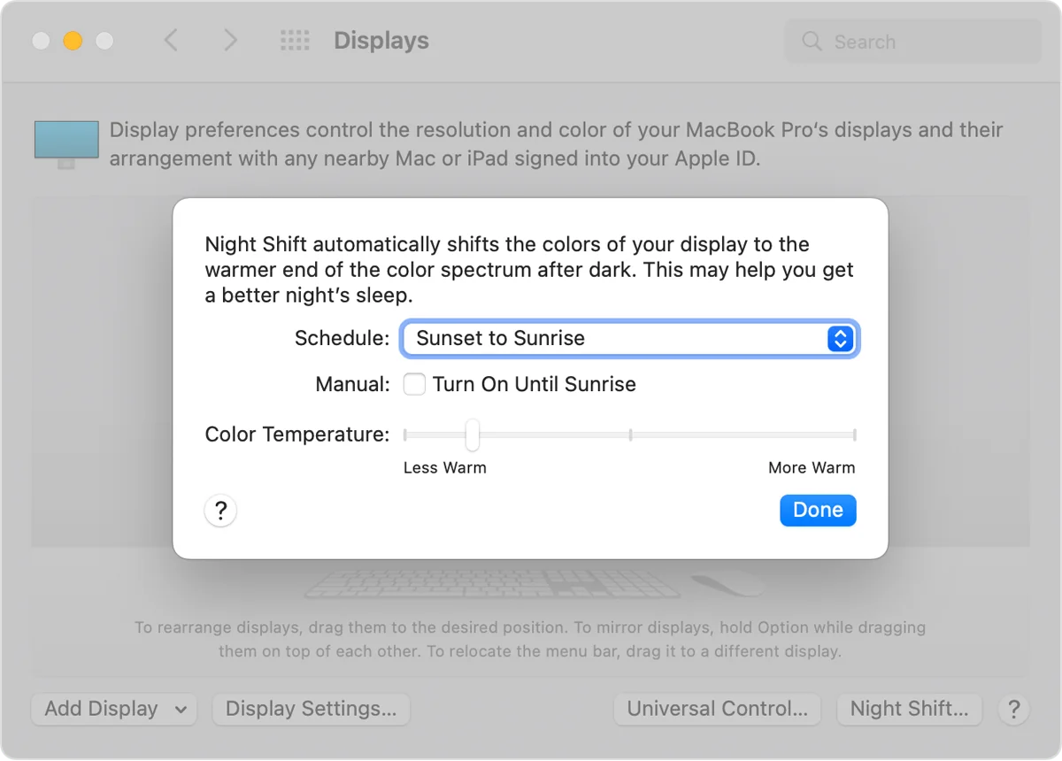
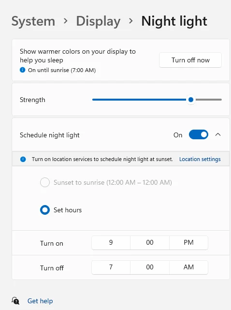
Apple Night Shift and Windows Night Light change the display’s color temperature. They can make a screen look warmer, but they do not restyle Salesforce components, change surface colors, or validate custom LWC compatibility.
Apple Night Shift with Salesforce
Use Night Shift when the goal is a warmer display at certain times. It can run alongside Salesforce dark mode, but evaluate the combined result because warm color filtering changes how status colors and charts appear.
Windows Night Light with Salesforce
Windows Night Light serves a similar display-level purpose. It does not replace native Salesforce dark mode and does not fix an sf dark contrast defect in a custom component.
Common Salesforce dark mode errors
The Dark Mode option does not appear in Themes and Branding
Confirm the theme is SLDS 2, the org edition is supported, and the release is active on the org’s instance. Also verify that you are editing the theme rather than only viewing it.
A custom LWC has unreadable text
Search its CSS for fixed values such as #fff, white, #000, and inline style attributes. Replace theme-dependent values with supported global styling hooks and retest both modes.
A page changes only when a browser extension is enabled
That behavior comes from the Salesforce dark theme Chrome extension, not the native org feature. Disable the extension, confirm the active SLDS 2 theme, and check the user’s Salesforce display preference.
System mode does not match the Salesforce mobile app
Salesforce Help states that color mode is not available for the Salesforce mobile app. Test the mobile app as a separate client rather than assuming it follows mobile web behavior.
Best practices for Salesforce dark mode rollout
- Enable Salesforce dark mode in a sandbox and test with production-like metadata.
- Inventory custom LWC, Aura, Visualforce, managed packages, and embedded content.
- Move custom components toward SLDS global styling hooks.
- Include keyboard and contrast checks in acceptance criteria.
- Run regression tests after seasonal releases and package upgrades.
- Document that the feature is Beta and list unsupported business-critical pages.
- Set an enterprise policy for any Salesforce dark theme Chrome extension.
- Provide users with a path to report sf dark issues and sf dark defects with screenshots and page URLs.
Related tutorials: review Salesforce Lightning Experience concepts, Lightning Web Components development, Salesforce security and permissions, and Salesforce release planning.
Frequently Asked Questions
Is Salesforce dark mode available natively?
Yes. Native Salesforce dark mode is available as a Beta SLDS 2 theme feature in supported editions. An administrator must enable it in Themes and Branding before users can select Light, Dark, or System mode.
Why can I not see the Salesforce dark mode setting?
The org may be using an SLDS 1 theme, the edition or feature may not be supported, the release may not yet be active on the instance, or the administrator may not have enabled the option.
Is a Salesforce dark theme Chrome extension safe?
Safety depends on the extension’s permissions, publisher, data practices, and maintenance. Review it under your organization’s browser-extension policy and disable it when diagnosing Salesforce UI problems.
Does sf dark work with custom Lightning web components?
It can, provided the component uses theme-aware SLDS global styling hooks or compatible base components. Hard-coded backgrounds and text colors often fail when users switch modes.
Does Salesforce dark mode work in the mobile app?
Salesforce Help states that color mode is not available for the Salesforce mobile app. Native mobile web behavior and the Salesforce mobile app should be tested separately.
Official Salesforce references