Lightning interface salesforce refers to the Lightning Experience user interface, the Lightning App Builder pages behind it, and the SLDS design rules that make custom components look consistent with Salesforce. For admins, it means choosing the right app, page, and action layout. For developers, it means building LWC screens that respect data security, accessibility, SLDS 2 theming, and page performance.
What is lightning interface salesforce?
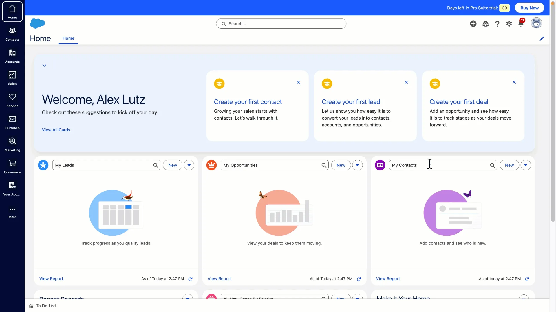
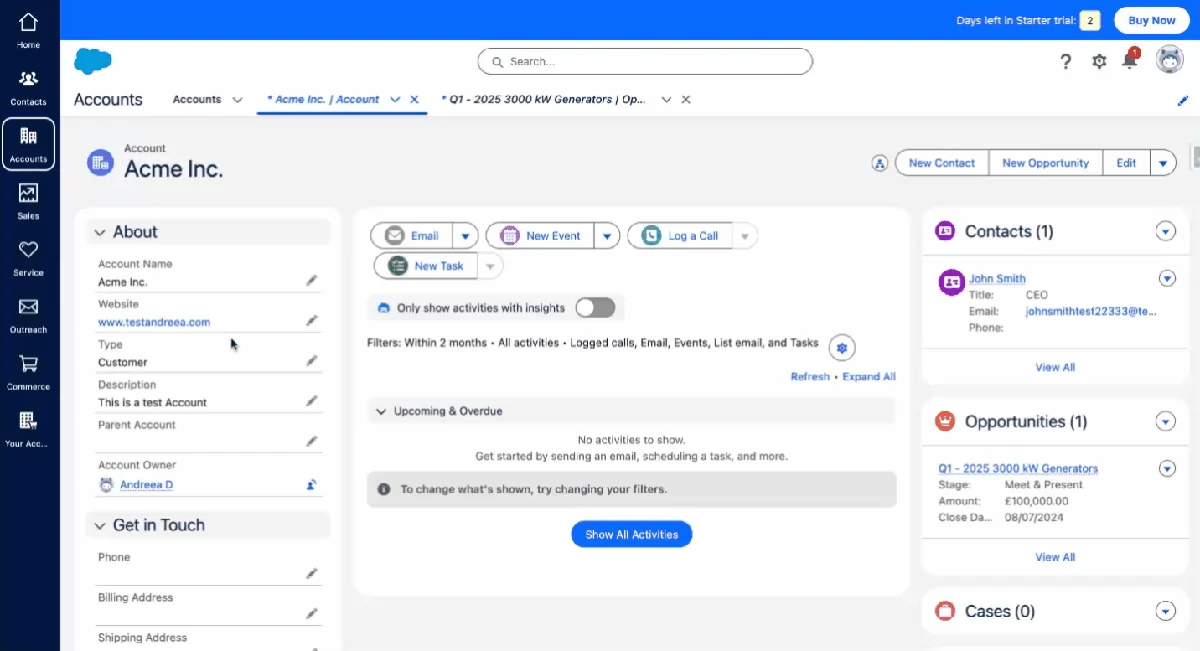
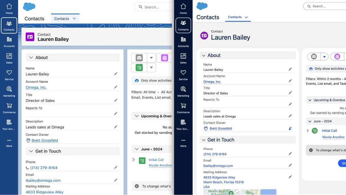
The phrase lightning interface salesforce is often used by admins who are trying to understand the difference between Salesforce Classic, Lightning Experience, Lightning pages, and custom Lightning Web Components. In practical terms, it is the working area where users search, navigate records, update data, run reports, open console tabs, and complete actions. This guide uses lightning interface salesforce as a practical term for that full user-facing layer.
The Lightning interface is not one setting. It is a stack of platform features: Lightning apps, navigation items, app pages, record pages, home pages, utility bars, quick actions, dynamic forms, Lightning base components, and custom LWC components. A good implementation makes the page match the user’s job. A poor one adds fields, tabs, and components without considering the next action the user must take.
In enterprise orgs, the best lightning interface salesforce decisions usually start with one question: what does this user need to do in the next two minutes? A sales rep may need account health, open opportunities, and a next-step action. A service agent may need case context, entitlements, knowledge, and a console layout. A finance user may need read-only record summaries and approval actions. The page should answer that job before it shows supporting data.
How the sfdc lightning ui is built
The sfdc lightning ui is built from metadata and web components. A planned sfdc lightning ui change should define which metadata changes and which code changes are in scope. Admins configure pages and actions in Setup and Lightning App Builder. Developers extend the interface with Lightning Web Components, Apex only when needed, and Salesforce Lightning Design System styles. Salesforce documents the SLDS 1 and SLDS 2 differences in the official Compare Salesforce Lightning Design System Versions guide.
Sfdc lightning ui: apps, pages, components, and metadata
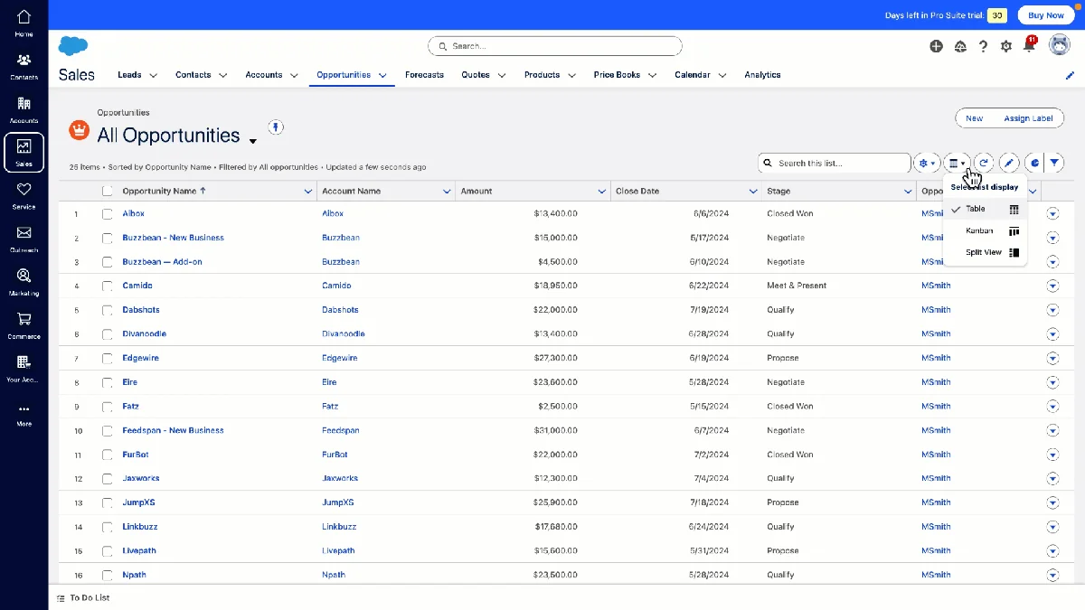
A Lightning app defines navigation, app options, utility items, and the experience a user opens from the App Launcher. A Lightning page defines the visible layout for a record, app, or home page. Components provide the content inside those regions. This separation matters because the sfdc lightning ui should not force every profile into one record page when different teams have different work patterns. For the sfdc lightning ui, keep navigation focused on daily objects and move occasional work into related tabs or actions.
| Layer | Who configures it | What it controls | Design check |
|---|---|---|---|
| Lightning app | Admin | Navigation items, utility bar, app branding, console behavior | Does the app include only the objects this role uses daily? |
| Record page | Admin or developer | Tabs, regions, dynamic forms, related lists, custom components | Does the top section show the fields needed for the next action? |
| Quick action | Admin or developer | Common updates, flows, modal forms, mobile actions | Can the user complete the task without scrolling through the page? |
| Lightning Web Component | Developer | Custom UI, data presentation, client behavior, integration surfaces | Does it use base components, SLDS hooks, and secure data access? |
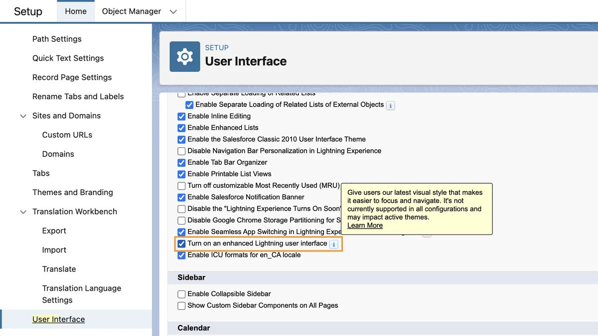
Sfdc interface choices admins control in Setup
The sfdc interface an admin controls includes app navigation, home page layout, object record pages, search layouts, compact layouts, actions, and field visibility. Admins also decide whether a page should use Dynamic Forms, Dynamic Actions, related list quick links, path, highlights panels, or a custom component region. Before changing a lightning interface salesforce page, document which users receive the page assignment.
Do not treat every field as a page design decision. Field-level security decides whether a user can see a field. Page layout and Dynamic Forms decide where a visible field appears. Sharing and organization-wide defaults decide record access. A clean sfdc interface respects all three layers instead of hiding sensitive data with CSS or conditional visibility alone. A secure sfdc interface starts with permission design before page design.
Salesforce user interface design choices developers control in LWC
salesforce user interface design for developers is mostly about restraint. Good salesforce user interface design reduces custom code where supported metadata already solves the problem. Use Lightning base components first, then SLDS utility classes, then styling hooks. This order keeps salesforce user interface design aligned with supported platform behavior. The official Salesforce LWC guide explains that base components in the lightning namespace use SLDS styling and component behavior; see Style Components with Lightning Design System.
When a custom LWC needs data, prefer Lightning Data Service or UI API wire adapters for record and metadata work. Salesforce states that UI API responses respect CRUD access, field-level security, and sharing settings; see Lightning Data Service. If you use Apex instead, enforce sharing, CRUD, and FLS in Apex. Do not rely on hidden HTML or JavaScript checks to protect data. The best lightning interface salesforce customizations make security a server-side and metadata decision, not a visual trick.
Lightning Interface Salesforce and SLDS 2 in 2026
lightning interface salesforce changed again with SLDS 2 and the Salesforce Cosmos theme path. SLDS 2 was introduced in Spring ’25 and uses a CSS framework that separates structure from visual styling through global styling hooks. The older SLDS version is now referred to as SLDS 1 in Salesforce documentation.
The main point for admins is simple: enabling a new theme can change the appearance of Lightning pages without changing the underlying data model, automations, or object permissions. Do not treat the refreshed lightning interface salesforce style as a data model migration. The main point for developers is stricter: unsupported CSS overrides may break when Salesforce changes the visual layer. A component that targets internal SLDS selectors such as nested .slds-input markup is more fragile than a component that uses base component attributes, SLDS utility classes, or supported styling hooks.
What changed from SLDS 1 to SLDS 2?
SLDS 1 supports design tokens and global styling hooks. SLDS 2 replaces design tokens with global styling hooks and adds more theme-aware styling behavior. Salesforce also notes that component-level styling hooks with the --slds-c-* prefix are not the same as global hooks with the --slds-g-* prefix. In 2026 projects, treat global hooks as the safer choice for cross-theme salesforce user interface design.
| Topic | Safer pattern | Risky pattern |
|---|---|---|
| Button appearance | Use lightning-button variants and SLDS utility classes |
Override internal button classes inside a base component |
| Component spacing | Use SLDS spacing utilities such as slds-p-around_medium |
Hard-code page-level CSS that affects unrelated regions |
| Theme color | Use global styling hooks with fallback values | Use old design token references in components that must support SLDS 2 |
| Data display | Use Lightning Data Service, UI API, or secured Apex | Expose hidden fields and depend on CSS to conceal them |
What to check before enabling Salesforce Cosmos or SLDS 2 themes
Before changing the theme in a production org, create a sandbox checklist for the lightning interface salesforce rollout. A lightning interface salesforce checklist should cover configuration, code, packages, and user acceptance testing. Review custom LWCs, Aura components, unmanaged CSS, Experience Cloud sites, Visualforce pages embedded in Lightning pages, console apps, and any managed package components that render core user workflows.
- Clone a representative Lightning app in a full or partial sandbox.
- Open high-use record pages for Sales, Service, and operations users.
- Check custom components for old design tokens, internal SLDS selector overrides, and hard-coded colors without contrast testing.
- Run regression tests for console tab behavior, quick actions, modal flows, and mobile form factor pages.
- Ask power users to validate the page against real work, not only screenshots.
How to design Lightning pages for users
A good lightning interface salesforce page helps the user decide, update, and move on. A page review for lightning interface salesforce should start with the record lifecycle and the person doing the work. Start with the record’s job. An opportunity page should answer stage, amount, close date, next step, decision makers, open activities, and risks. A case page should answer customer, severity, entitlement, status, timeline, and knowledge suggestions. A custom object page should answer whatever action moves the process forward.
Use this sequence when redesigning a record page. For lightning interface salesforce, the goal is a record page that removes uncertainty and shows the next action quickly:
- List the top five user tasks. Do this by role, not by department name.
- Map each task to data. Identify fields, related records, reports, actions, and flows required for the task.
- Place decision fields above supporting fields. Users should not scroll before they see status, owner, priority, stage, or next action.
- Move exceptions into tabs or conditional regions. A field needed once a month should not block a task performed every hour.
- Measure page load and adoption. Check Lightning Usage App data, user feedback, and record page performance in sandbox before rollout.
Salesforce user interface design for record pages
salesforce user interface design is not only visual styling. It includes information order, permission-aware visibility, component loading behavior, and accessibility. If a page has many conditional components, test the actual combinations assigned by app, record type, profile, and permission set. A page that looks clean to an admin may still be slow for a standard user with fewer permissions and more related records.
Sfdc interface design for mobile and console users
The sfdc interface should be tested separately for desktop, Salesforce mobile app, and console apps. Console users often need density and keyboard-friendly navigation. Mobile users need fewer regions, clear actions, and fields that fit small screens. A component that works on a desktop record page may be unsuitable in mobile if it assumes a wide grid or places the only save action below a long panel.
LWC example for Salesforce user interface design
This lightning interface salesforce LWC example shows a record-page component for account summary fields. It uses Lightning base components and Lightning Data Service through lightning-record-view-form. The example does not run SOQL and does not consume Apex governor limits. If you replace it with Apex later, bulkify queries, keep SOQL out of loops, and enforce object and field permissions.
Component HTML
<template>
  <lightning-card title="Account Snapshot" icon-name="standard:account">
    <div class="slds-p-around_medium sft-account-panel">
      <lightning-record-view-form record-id={recordId} object-api-name="Account">
        <div class="slds-grid slds-wrap slds-gutters">
          <div class="slds-col slds-size_1-of-1 slds-medium-size_1-of-2">
            <lightning-output-field field-name="Name"></lightning-output-field>
          </div>
          <div class="slds-col slds-size_1-of-1 slds-medium-size_1-of-2">
            <lightning-output-field field-name="Industry"></lightning-output-field>
          </div>
          <div class="slds-col slds-size_1-of-1 slds-medium-size_1-of-2">
            <lightning-output-field field-name="Type"></lightning-output-field>
          </div>
          <div class="slds-col slds-size_1-of-1 slds-medium-size_1-of-2">
            <lightning-output-field field-name="OwnerId"></lightning-output-field>
          </div>
        </div>
      </lightning-record-view-form>
    </div>
  </lightning-card>
</template>
Component JavaScript
import { LightningElement, api } from 'lwc';

export default class AccountSnapshot extends LightningElement {
  @api recordId;
}
Component CSS with theme-aware hooks
.sft-account-panel {
  background: var(--slds-g-color-surface-container-1, #f3f3f3);
  border: var(--slds-g-sizing-border-1, 1px) solid var(--slds-g-color-border-base-1, #c9c9c9);
  border-radius: var(--slds-g-radius-border-2, 0.5rem);
}
Component metadata for App Builder
<?xml version="1.0" encoding="UTF-8"?>
<LightningComponentBundle xmlns="http://soap.sforce.com/2006/04/metadata">
  <apiVersion>67.0</apiVersion>
  <isExposed>true</isExposed>
  <targets>
    <target>lightning__RecordPage</target>
  </targets>
  <targetConfigs>
    <targetConfig targets="lightning__RecordPage">
      <objects>
        <object>Account</object>
      </objects>
    </targetConfig>
  </targetConfigs>
</LightningComponentBundle>
The sample uses API version 67.0 for Summer ’26 orgs. If your sandbox is still on Spring ’26, use the latest API version available in that org and validate before deploying. This is a safe sfdc lightning ui pattern because it starts with base components, keeps styling scoped to the component, and relies on platform data access instead of a custom Apex controller. Use the same sfdc lightning ui pattern for small summary panels before writing Apex-backed components.
Common errors with Lightning Interface Salesforce customizations
Most lightning interface salesforce issues come from mixing admin layout choices with developer styling shortcuts. A lightning interface salesforce defect may look like styling, but the root cause is often page assignment, data access, or unsupported CSS. The result may work for one user in one app but fail in console, mobile, sandbox refreshes, or theme changes.
- Overriding internal SLDS selectors: Do not depend on internal markup inside Lightning base components. Salesforce can change that markup.
- Using CSS to hide secure data: Conditional visibility is not a security control. Use sharing, CRUD, FLS, permission sets, and secured Apex where required.
- Building custom UI before checking base components: Base components provide SLDS styling, accessibility behavior, and supported APIs. They also keep the sfdc lightning ui closer to Salesforce-supported behavior.
- Ignoring form factor: Test the sfdc interface in desktop, console, and mobile before assigning the page broadly. A sfdc interface that works only on a wide monitor is not ready for mobile users.
- Loading too much data on page open: Avoid components that call multiple Apex methods on initial render when the same data can be placed behind tabs, actions, or lazy regions.
- Skipping user acceptance testing: A page can be technically correct and still slow down users if the field order does not match their process.
Best practices for lightning interface salesforce in enterprise orgs
For a stable lightning interface salesforce rollout, keep the configuration boring and test the edge cases. A mature sfdc interface review checks app navigation, page visibility, and component behavior together. Enterprise orgs usually fail on exceptions: several business units, managed packages, translation, console apps, mobile users, and permission-set combinations.
- Design by persona and record lifecycle. Do not make one Account page carry every possible process.
- Prefer standard metadata first. Try Dynamic Forms, Dynamic Actions, compact layouts, related lists, and Flow actions before building custom code.
- Use Lightning base components in custom LWC. They give your sfdc lightning ui a supported path for SLDS updates.
- Keep component CSS scoped. Use component stylesheets, SLDS utilities, and global styling hooks. Avoid page-wide CSS that changes unrelated components.
- Validate accessibility. Labels, keyboard navigation, focus state, and contrast matter. Base components help, but custom markup still needs testing. Treat accessibility as part of salesforce user interface design, not as a final review step.
- Measure before and after. Track page load behavior, support tickets, user adoption, and process completion time after a redesign.
Related SalesforceTutorial resources
Use these related guides when your lightning interface salesforce work moves into development, customization, reporting, release planning, or another lightning interface salesforce rollout:
- Lightning Web Components tutorial for Salesforce developers
- Salesforce customization best practices for admins and architects
- Salesforce reports and dashboards guide for Lightning users
- Salesforce release updates and admin planning checklist
Frequently Asked Questions
What does lightning interface salesforce mean?
lightning interface salesforce means the Lightning Experience interface users work in, plus the app, page, action, and component configuration behind that interface. It includes standard Salesforce UI features and custom Lightning Web Components.
Is sfdc lightning ui the same as Salesforce Lightning Experience?
sfdc lightning ui usually refers to Salesforce Lightning Experience from an implementation point of view. Lightning Experience is the product interface; the UI also includes Lightning App Builder metadata, page assignments, components, utility bars, and theming choices.
Should admins use Dynamic Forms or custom LWC for a sfdc interface?
Use Dynamic Forms when the requirement is field placement, conditional field visibility, or record-page simplification. Dynamic Forms often improve the sfdc interface without introducing a new code asset. Use custom LWC when the interface needs behavior that standard metadata cannot provide, such as a guided data panel, custom integration output, or a purpose-built workspace.
How does SLDS 2 affect salesforce user interface design?
SLDS 2 affects salesforce user interface design by moving more visual decisions to global styling hooks and theme-aware values. In practice, salesforce user interface design reviews should include theme behavior and contrast checks. Components that use base components, SLDS utilities, and supported hooks are easier to validate across Salesforce Cosmos and future theme changes.
Do Lightning Web Components automatically enforce field security?
Lightning Web Components do not automatically make all custom data access secure. Components that use Lightning Data Service or UI API wire adapters respect CRUD, field-level security, and sharing for supported operations. If the component calls Apex, the Apex class must enforce sharing, CRUD, and FLS explicitly.