Apex:TabPanel Tag
Apex:TabPanel Tag :- In our previous Salesforce Tutorial we have learned about visualforce apex:toolbar tag. In this Salesforce Developer Tutorial we are going to learn about apex:tabpanel tag and how this tag works when used in visualforce page.
<Apex:TabPanel>:- Apex:tabpanel is a tag which is used to create Tab Section on the header of the visualforce page. We can also add content, inputfields, link and so on to those tabs. We can switch between two tabs from one tab to another.
Ex:- <apex:tabpanel switchType=”client” selectedTab=”Salesforce Tutorials” id=”thetabpnel”>
Different attributes supported by apex:tabpanel tag.
| activeTabClass | contentClass | contentStyle | dir |
| disabledTabClass | headeralignment | headerclass | headerspacing |
| lang | immediate | id , width | height |
| onclik | inactiveTabClass | ondblclick | onkeydown |
| onkeypress | onkeyup | onmousedown | onmousemove |
| onmouseout | onmouseover | onmouseup | rendered |
| reRender | selectedTab | style | styleclass |
| switchtype | tabclass | title | value |
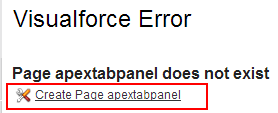
Create new visualforce page as shown below.
Now select Create Page apex tabpanel link to create new visualforce page.
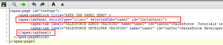
Now enter the code written below.
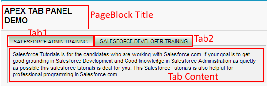
From above salesforce developer tutorial we have create a pageblock and named it as “APEX TAB PANEL DEMo”. <apex:tabpanel> tag creates a section to create Tabs in the header of the page. <apex:tab> create new tab and label=”Title” will be label for tab. If we want to add description under those tabs use description before closing tag of </apex:tab>.