
Apex:panelBar :In our Previous Salesforce Training we have learned about apex: pageMessage tag and how it works when used in visualforce page. In this Salesforce Training Tutorial we are going to learn about apex:panelBar and apex:panelBarItem tags.
Apex:panelBar
<Apex:PanelBar> :- apex:panelBar is used to insert headers in visualforce page. <apex:panelBarItem> tag is used as a child item for <apex:panelBar> tag. We can used nearly 1000 panel bar items as child items of apex: Panelbar tag. When we click on the header of the <apex:panelBarItem> it expands and the content in the panelbarItem is displayed. Only clicked item only displayed remaining items will be hidden.
Different attributes supported by apex:panelBar tag.
| contentClass | contentStyle | headerClass | headerClassActive |
| headerStyle | headerStyleActive | height | id |
| rendered | style | styleclass | SwitchType |
| value | var | width |
Let us see how apex:panelBar tag works in visualforce.
Create new Visualforce page as shown below.

Click on create page apexpanelbar link as shown below.

Enter the code shown below.

From above salesforce training tutorial we have used <apex:panelbar> tag as a parent component and we have used <apex:panelBarItem> tag as a child component. Enter the label to display. Content for panelbaritem is written between label and </apex:panelbarItem>.
Output : Apex:panelbarItem Tag.
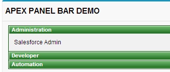
We have created three apex:panelbarItem and the output is as shown above.