
As a Salesforce Admin, mastering Screen Flows is essential for creating dynamic and user-friendly interfaces that streamline business processes. Screen Flows allow you to build interactive screens without writing code, enhancing user experience and efficiency. This article delves into the different Screen Flow Components for Salesforce Admins and explains how to use each one effectively.
Introduction to Screen Flows
Screen Flows are a type of Flow in Salesforce that require user interaction. They guide users through a series of screens to collect or display information, making complex tasks more manageable. By understanding each component, you can tailor Screen Flows to meet specific business needs.
Screen Flow Components for Salesforce Admins Explained
Below are the key Screen Flow components, each explained in short paragraphs to help you grasp their purpose and usage.
1. Display Text
The Display Text component allows you to present rich text on the screen. You can include formatted text, images, and hyperlinks. This component is ideal for providing instructions, headings, or any informational content that doesn’t require user input. It helps guide users through the flow by offering context or explanations at various stages.
2. Text
The Text component collects short text input from users. It’s used for fields like names, titles, or any brief information. You can set input validations, such as character limits or required fields, to ensure data quality. This component is fundamental for capturing user responses that are integral to your business processes.
3. Long Text Area
The Long Text Area is designed for longer text inputs. It’s suitable for collecting detailed information like descriptions, comments, or feedback. This component provides users with a larger text box, making it easier to enter extended responses without feeling constrained by space limitations.
4. Number
The Number component collects numeric input from users. It’s useful for quantities, amounts, percentages, or any data that requires numerical values. You can define minimum and maximum values to prevent invalid entries, ensuring that the data aligns with expected parameters.
5. Checkbox
The Checkbox component allows users to select a boolean value—true or false. It’s perfect for simple yes/no questions or to confirm acceptance of terms and conditions. This component provides a straightforward way for users to make binary choices within the flow.
6. Picklist
The Picklist component presents a dropdown menu of predefined options. Users can select one option from the list. This is ideal for standardizing inputs like selecting a country, department, or category. It ensures consistency in data entry by limiting choices to predefined values.
7. Multi-Select Picklist
Similar to the Picklist, the Multi-Select Picklist allows users to select multiple options from a list. It’s useful when more than one choice is applicable, such as selecting multiple interests or applicable services. This component enhances flexibility in user responses while maintaining control over the available options.
8. Radio Buttons
The Radio Buttons component displays a list of options where users can select only one. Unlike picklists, all options are visible without clicking a dropdown, which can improve user experience when the number of options is limited. It’s suitable for selections like choosing a preferred contact method or payment option.
9. Checkbox Group
The Checkbox Group component allows users to select multiple options from a set displayed as checkboxes. It’s ideal for questions where several responses may apply, such as selecting subscription preferences or multiple skills. This component provides a clear visual indication of all available choices.
10. Date
The Date component enables users to input a date using a date picker. It’s useful for collecting information like birthdates, appointment dates, or deadlines. This component reduces errors associated with manual date entry by providing a standardized format and calendar interface.
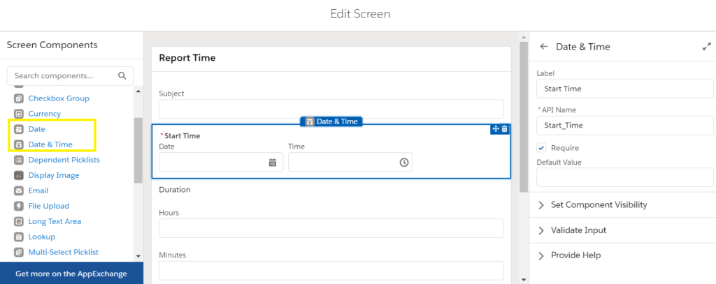
11. Date/Time
Building on the Date component, the Date/Time component collects both date and time inputs. It’s suitable for scheduling events or meetings where the specific time is as important as the date. Users can select from a calendar and specify the time, ensuring precise scheduling.
12. Email
The Email component collects email addresses and validates the input format. It’s essential for capturing contact information or sending confirmations. This component helps ensure that the emails entered are correctly formatted, reducing the chance of errors in communication.
13. Phone
The Phone component collects phone numbers, offering validation based on phone number formats. It’s used for gathering contact numbers while ensuring consistency and correctness in the data collected. This component can be customized to accept international formats if needed.
14. Address
The Address component provides fields for a complete address, including street, city, state, postal code, and country. It’s designed to standardize address collection, making it easier for users to enter location information accurately. This component can help with shipping details, billing information, or any scenario requiring an address.
15. File Upload
The File Upload component allows users to attach files directly within the flow. It’s beneficial when you need to collect documents, images, or any file attachments, such as resumes, identification documents, or proof of purchase. This component simplifies the process of gathering additional information from users.
16. Lookup
The Lookup component enables users to search for and select a record from a Salesforce object. It’s particularly useful when an action needs to be associated with an existing record, like selecting an Account or Contact. This component ensures that users link to the correct records, maintaining data integrity.
17. Image
The Image component displays images within your flow screens. You can use it to incorporate logos, icons, or illustrative images that enhance the visual appeal and branding of the flow. It can also serve as a visual cue to aid user understanding.
18. Section
The Section component helps organize your screen by dividing it into multiple columns and rows. This allows you to group related fields together and create a structured layout. It’s especially helpful in complex screens where you want to improve readability and user navigation.
19. Display Choice
The Display Choice component presents choices to users in formats like picklists, radio buttons, or checkbox groups, but it’s dynamically generated. You can use it to display options based on records or variables, providing a customized user experience.
20. Toggle
The Toggle component provides a switch that users can turn on or off. It’s an alternative to the checkbox, offering a more modern interface for binary choices. This component enhances the aesthetic of your flow while maintaining functionality.
Best Practices for Using Screen Flow Components
- Simplicity: Keep screens uncluttered by only including necessary components.
- Clarity: Use clear labels and help text to guide users effectively.
- Validation: Implement input validations to ensure data quality.
- Navigation: Use the Section component to organize fields logically.
- Conditional Visibility: Show or hide components based on user input to create dynamic flows.
Conclusion
By understanding and effectively utilizing these Screen Flow Components for Salesforce Admins, Salesforce Admins can create powerful, user-friendly interfaces that enhance data collection and streamline business processes. Each component serves a specific purpose, and when combined thoughtfully, they can significantly improve the user experience within your Salesforce org.
Embrace these components to build interactive and efficient Screen Flows that meet your organization’s unique requirements. Continuous learning and experimentation with these tools will empower you to optimize processes and drive success in your Salesforce environment.